Rothko's Color
April 2025
Color Analysis
Python, pillow library
Python script to analyze color in images and abstract it down to a percentage bar chart.
Background
I originally wrote this python script to analyize the colors on a website, after I heard someone describe a UX research project where they were doing this manually. The program looks at an image, pixel by pixel, breaks down the colors by percentage of total image space.
Partially inspired by the new Portland Art Museum Mark Rothko Pavilion (November 20, 2025), I was curious about how this modernist color field painter’s relationship with color changed over the course of his life time. I wanted to visualize this change over time in pure color. I rewrote my original python code to output to a nice stacked horizontal bar chart.
Data
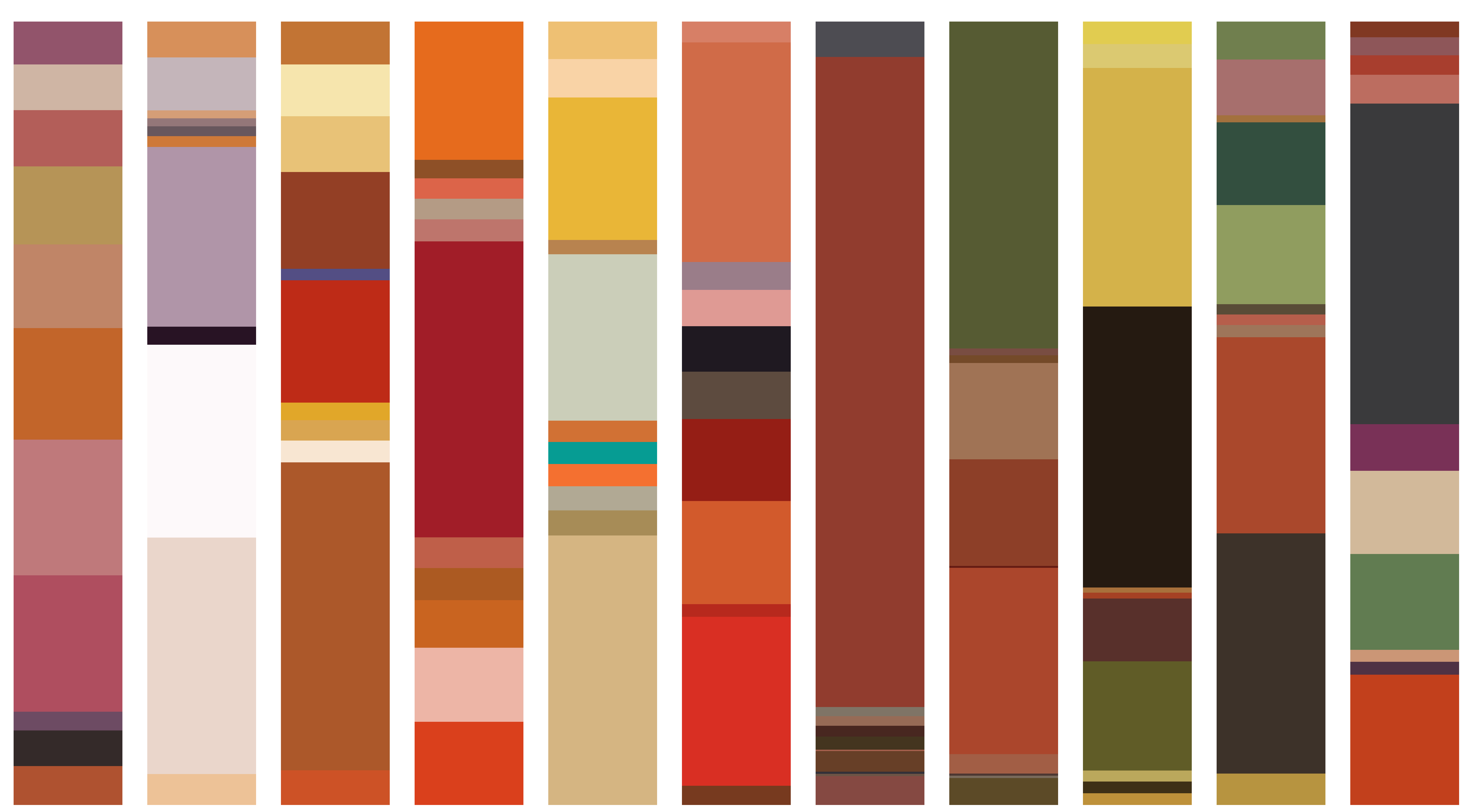
I got image files of 94 Mark Rothko paintings from wikiart.org with title and year information. Data cleaning consisted of cropping out the frame or wall background on many of the images.
Examples of Rothko classic colorfield paintings shown with their color analysis:
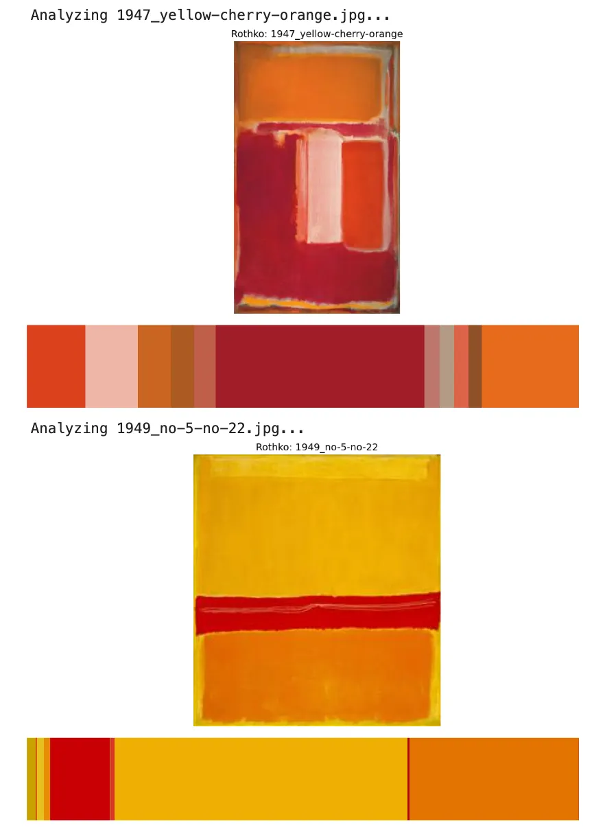
This is a representation of Mark Rothko's use of color over the course of his painting career, in chronological order (as available on wikiart.org)

Original Color Breakdown Code
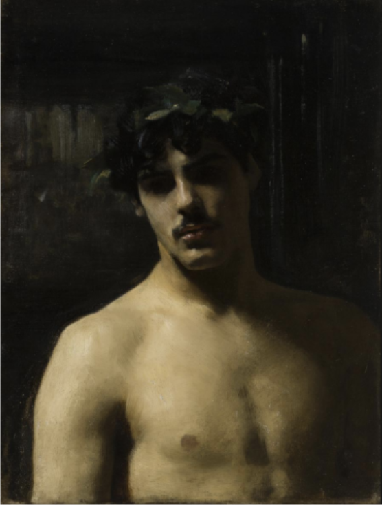
I originally created this to help with website color analysis for UI/UX research. But I had the idea to use in the art realm when viewing a painting by John Singer Sargent, 'Man with Laurels', from the Los Angeles County Museum of Art Permanent Collection. This painting has always been interesting to me because it conveys so much with such a limited palette. Contrast to Rothko's abstract minimalism, where color is the primary vehicle for expression.

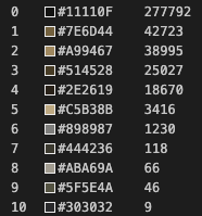
Color breakdown by hex code and pixel count:
Python Code for Image Color Analysis
# Imports
import numpy as np
import pandas as pd
import matplotlib.pyplot as plt
import matplotlib.patches as patches
import matplotlib.image as mpimg
from IPython.display import display_html, display, HTML
from PIL import Image
from matplotlib.offsetbox import OffsetImage, AnnotationBbox
import urllib
import cv2
import extcolors
from colormap import rgb2hex
import urllib.request

# For local image
path = "./sargent_man_laurels.png"
output_width = 900
img = Image.open(path)

# Display the image
plt.figure(figsize=(9, 9))
plt.imshow(img)
plt.axis('off')
plt.show()
colors_x = extcolors.extract_from_image(img, tolerance=12, limit=12)

def color_to_df(input):
    colors_pre_list = str(input).replace('([(','').split(', (')[0:-1]
    df_rgb = [i.split('), ')[0] + ')' for i in colors_pre_list]
    df_percent = [i.split('), ')[1].replace(')','') for i in colors_pre_list]

    #convert RGB to HEX code
    df_color_up = [rgb2hex(int(i.split(", ")[0].replace("(","")), int(i.split(", ")[1]), int(i.split(", ")[2].replace(")",""))) for i in df_rgb]

    df = pd.DataFrame(zip(df_color_up, df_percent), columns = ['c_code', 'occurrence'])
    return df

df_color = color_to_df(colors_x)

df_color
c_code occurrence 0 #11110F 277792 1 #7E6D44 42723 2 #A99467 38995 3 #514528 25027 4 #2E2619 18670 5 #C5B38B 3416 6 #898987 1230 7 #444236 118 8 #ABA69A 66 9 #5F5E4A 46 10 #303032 9
# Create color list
list_color = list(df_color['c_code'])
list_precent = [int(i) for i in list(df_color['occurrence'])]
text_c = [c + ' ' + str(round(p*100/sum(list_precent),1)) +'%' for c, p in zip(list_color, list_precent)]

# Sort data by occurrence (descending)
df_color = df_color.sort_values('occurrence', ascending=False)

# Extract colors and occurrence values
list_color = list(df_color['c_code'])
list_occurrence = [int(i) for i in list(df_color['occurrence'])]

# Calculate percentages
total_pixels = sum(list_occurrence)
percentages = [round(count*100/total_pixels, 1) for count in list_occurrence]
Visualization options
Circle
# Circle pie chart
fig, ax = plt.subplots(figsize=(90,90),dpi=10)

wedges, text = ax.pie(list_precent, colors = list_color)
plt.setp(wedges, width = 0.5)
ax.set_aspect("equal")
fig.set_facecolor('white')
print(img)
plt.show()
Horizontal Stacked Bar
# Horizontal stacked bar chart
fig, ax = plt.figure(figsize=(12, 3)), plt.subplot(111)

left = 0
for i, (color, width) in enumerate(zip(list_color, list_occurrence)):
    ax.barh(0, width, left=left, color=color, height=1)

    left += width

# Remove ticks and labels
ax.set_yticks([])
ax.set_yticklabels([])
ax.set_xticks([])
ax.set_xticklabels([])

plt.title('Color Distribution')

# Remove spines
for spine in ax.spines.values():
    spine.set_visible(False)

plt.tight_layout()
print(img)
plt.show()